Agarwal Global x Urteqi

BUILDING A STRONG

INDUSTRIAL BRAND

IDENTITY

A Modern Visual System Designed for Precision, Growth & Impact
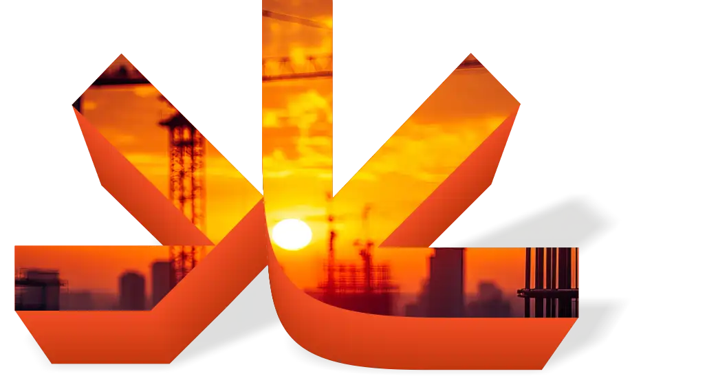
Logmaking sketchbook

  • Brand Strategy
  • Logo Identity
  • Visual Language
  • Industrial Branding
  • Brand System
  • Typography Design

INTRODUCTION

GT Reality’s brand identity is crafted to reflect the core values of engineering — strength, structure, and reliability. The design approach focuses on creating a bold and modern visual presence that stands out in the industrial and construction sector while maintaining clarity and professionalism.

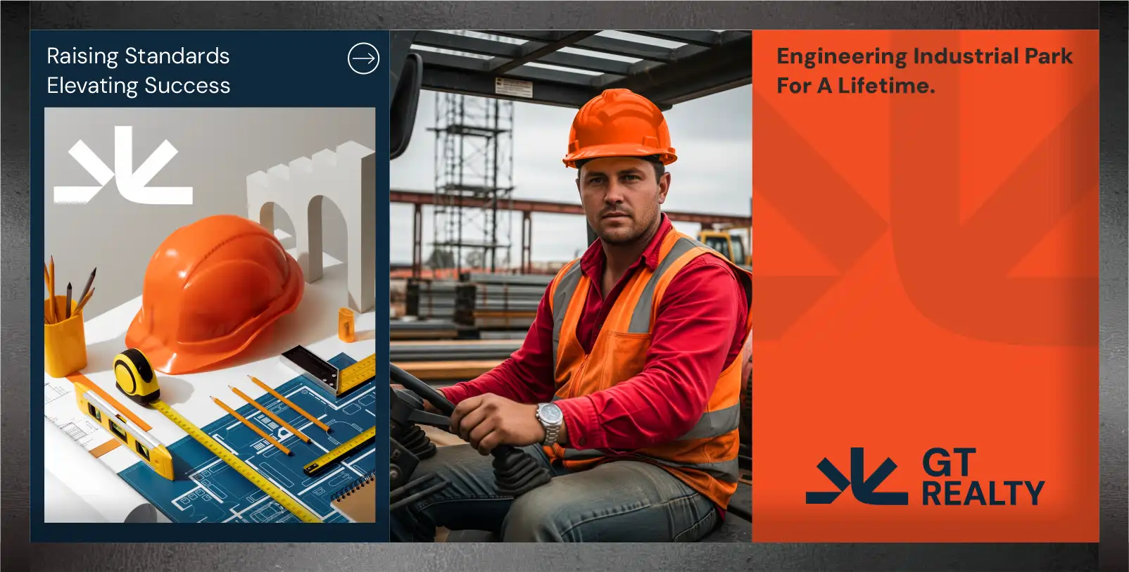
LOGO IDENTITY DESIGN

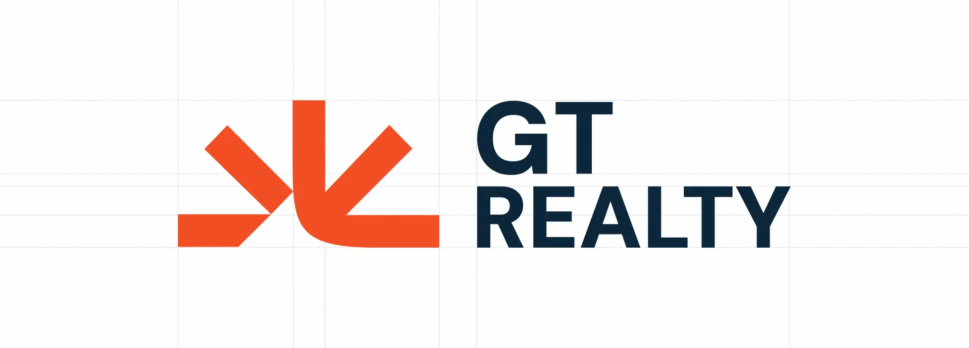
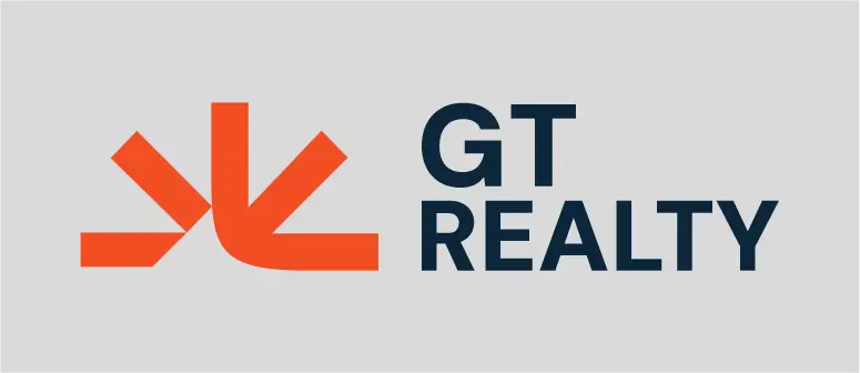
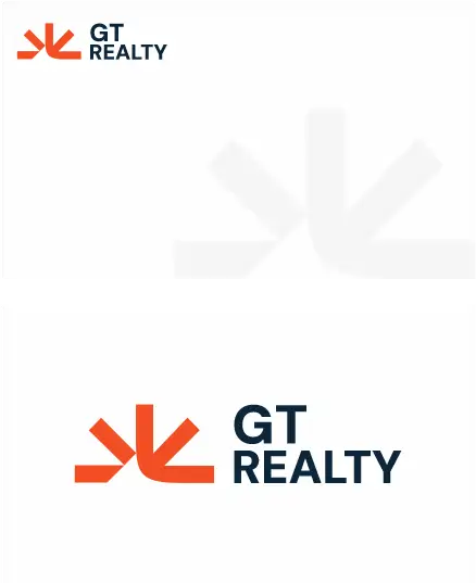
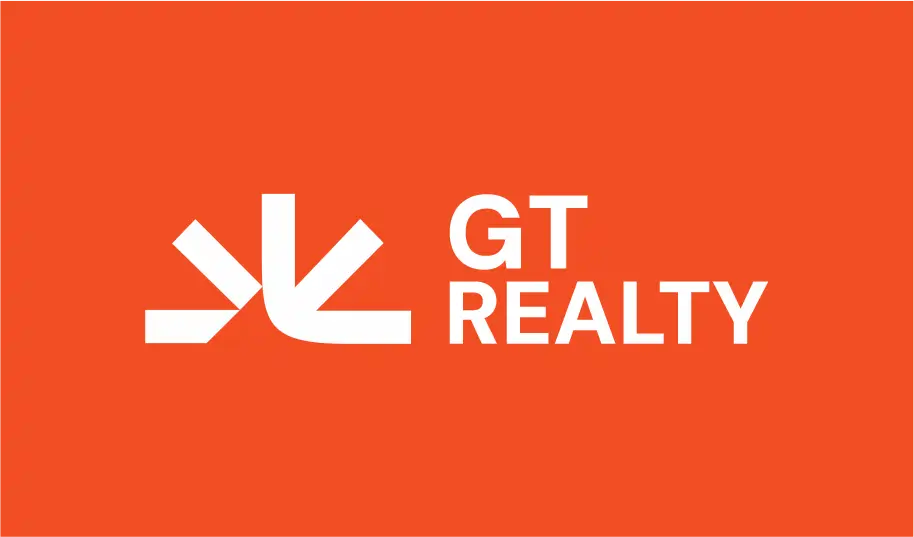
The identity is built around a strong geometric symbol that represents: Structural stability • Forward movement • Industrial precision

LOGO DESIGN PROCESS

01

Structural Thinking

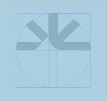
The logo was developed using a grid-based approach, ensuring balance, alignment, and consistency — reflecting real-world engineering principles

02

Form & Symbol

A sharp, angular mark was created to express direction, growth, and strength, making the identity simple yet powerful.

03

Typeface Selection

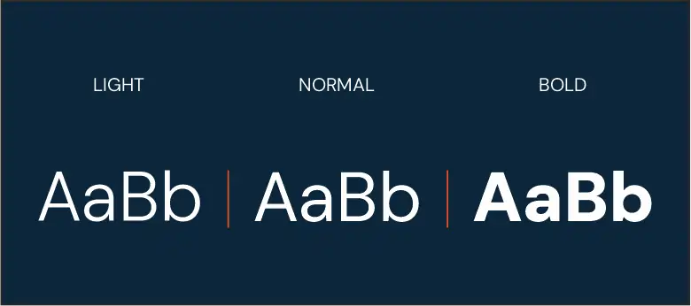
Bold, clean typography enhances readability and reinforces a strong industrial tone across all brand applications.

04

Color Direction

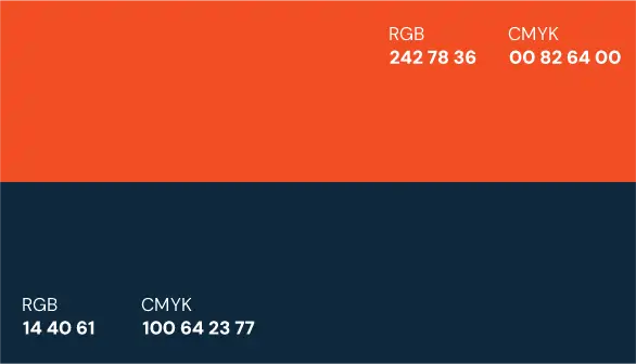
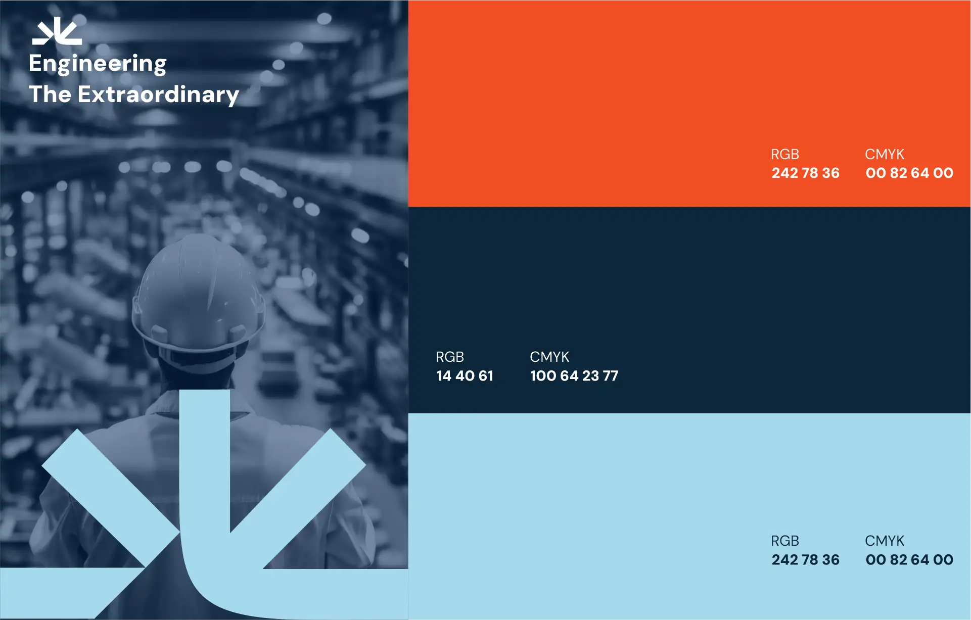
The color palette was carefully chosen to create contrast and impact: Orange for energy and action, Deep navy for trust and stability

Brand Logo
Construction Image
Typography
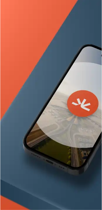
Mobile Preview
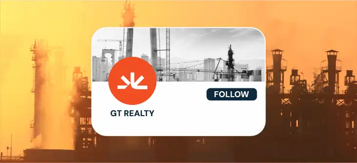
Social Banner
Structure Grid
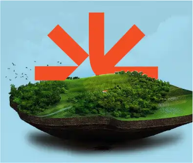
3D Visual
Color Palette
Logo Variations
Primary Identity

VISUAL IDENTITY SYSTEM

The identity extends beyond the logo into a complete visual language:
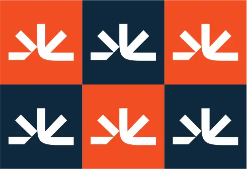
Repeating geometric patterns • Strong angular compositions • Consistent color application Creating a unified and recognizable industrial brand presence.
Typography Letters

A cohesive and future-ready brand identity that positions GT Reality as a strong, reliable, and forward-thinking industrial brand, built to stand out and scale.