LOGO MAKING
PROCESS
- VISUAL IDENTITY
The logo for Aggarwal Global was not designed as a graphic—but as a system of meaning.
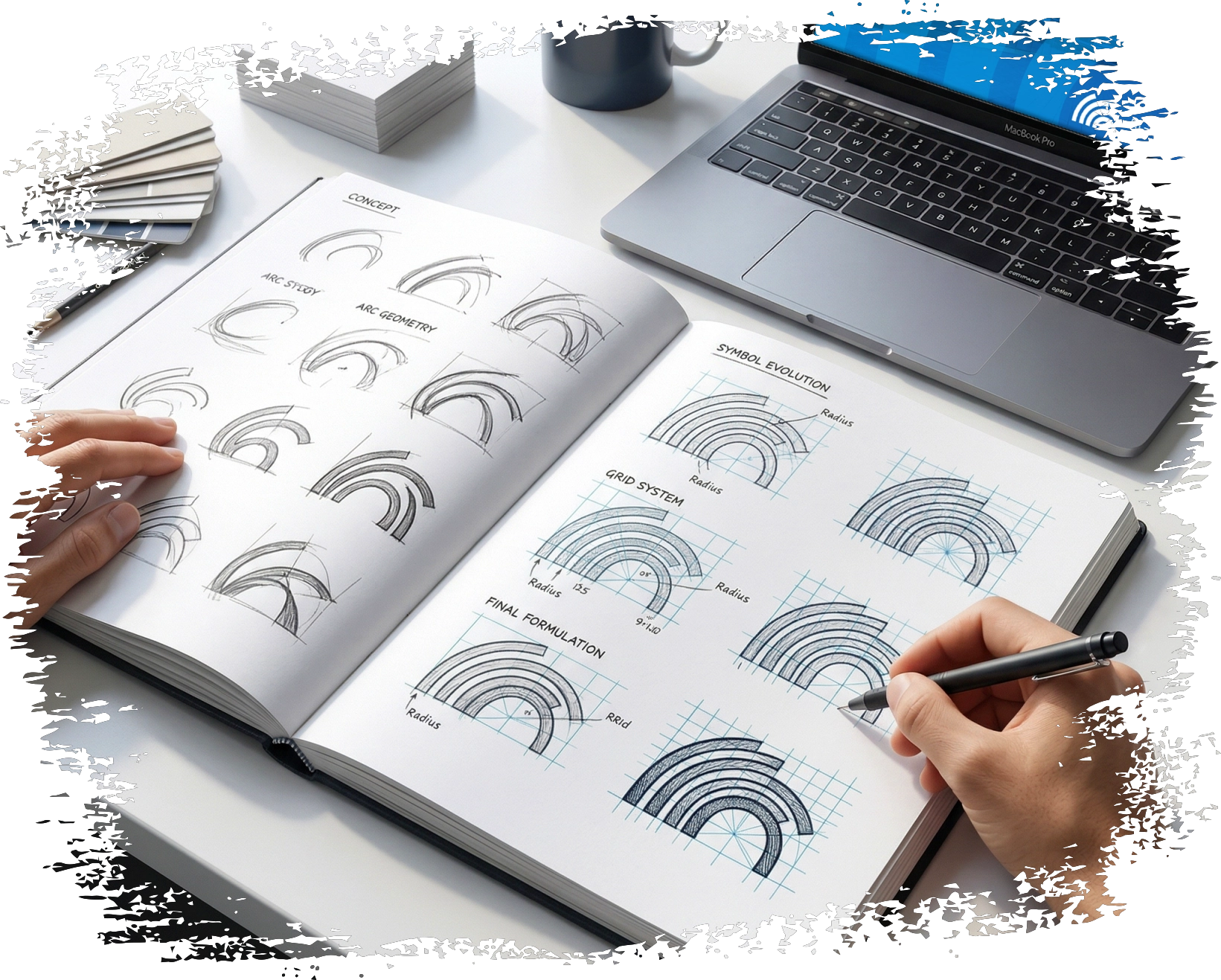
Concept Development
The final mark is built using layered arc forms—inspired by:

Communication waves

Expanding global reach

Structured clarity
These arcs create a visual rhythm that reflects how
messages
travel across borders—accurately and seamlessly.
Design Philosophy
Every element serves a purpose:

Curves
fluid communication

Spacing
clarity and precision

Balance
trust and professionalism
The design avoids complexity, ensuring the brand remains instantly recognizable and scalable.
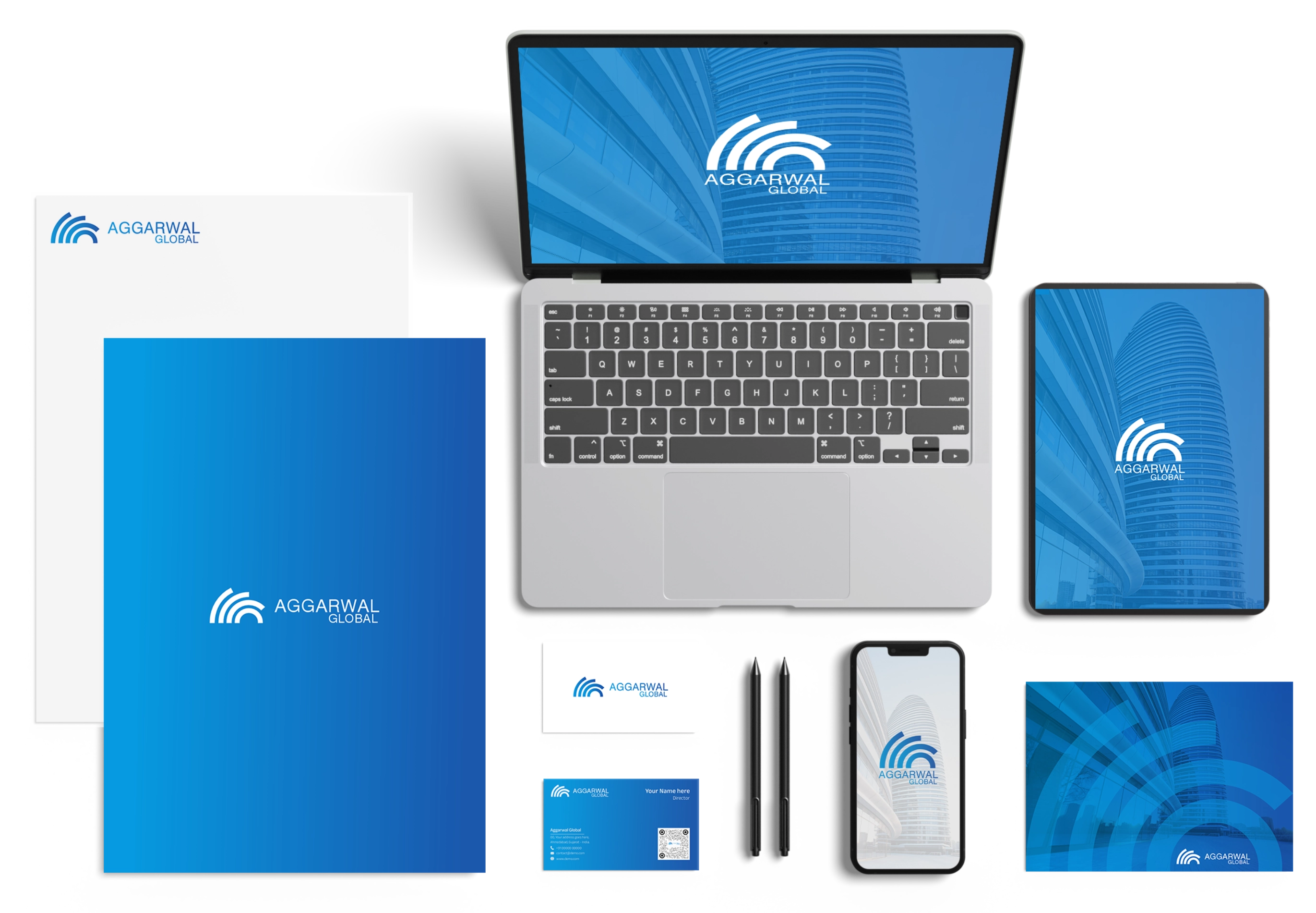
Design Approach
The brand identity was built around the idea of
clarity as a universal language.
A Visual system was developed using:
- Arc-based forms representing communication waves and global reach
- Clean typography for readability and professionalism
- A blue gradient palette symbolizing trust, intelligence, and global connectivity

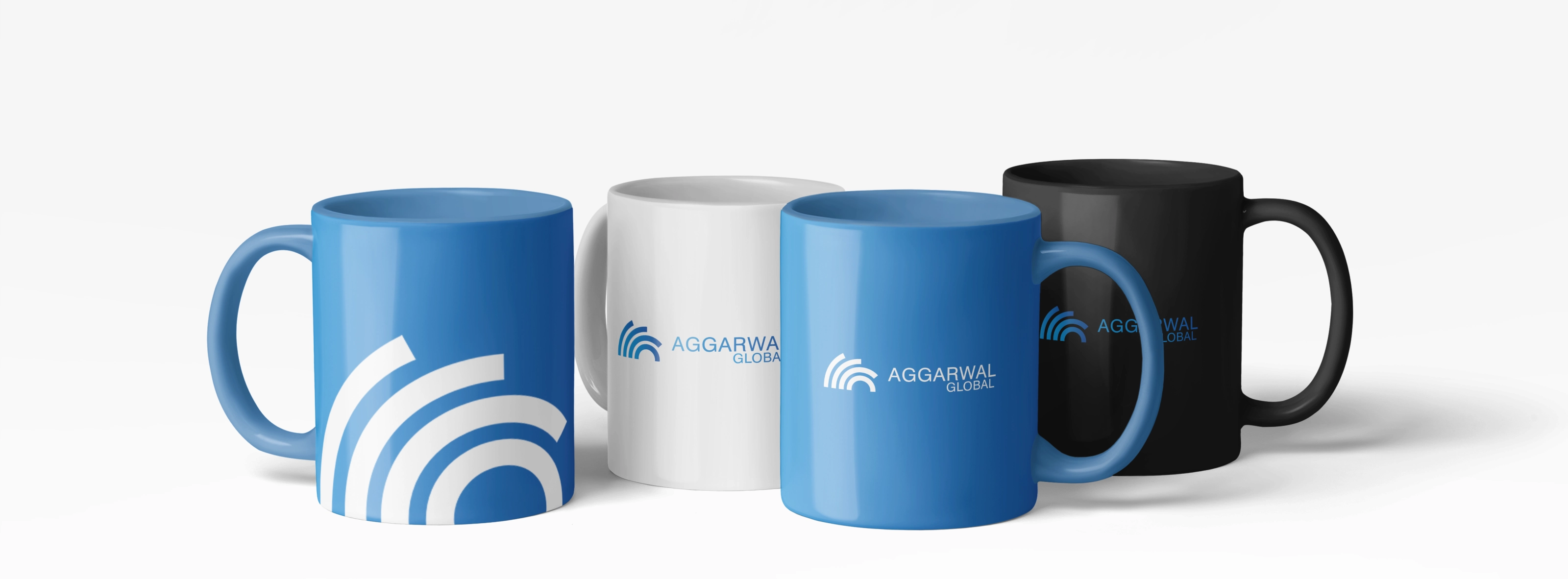
More than a logo, it's a system of clarity designed to communicate across cultures and markets. A mark that reflects precision, trust, and a truly global perspective.
